Fuksja, nektarynkowy czy akwamaryna to nazwy kolorów z którymi mamy do czynienia na co dzień. Złośliwi mogliby dopowiedzieć, że właściwie ma do czynienia z nimi jedynie płeć piękna, gdyż dla zdecydowanej większości mężczyzn będzie to po prostu róż, pomarańcz i „woda morska”. Niezależnie od tychże złośliwości takie nazewnictwo wydaje się dla nas intuicyjne i oczywiste. Spodziewać by się należało że nazwy, które obecne są w języku codziennym przenikną także do języka designerów i jasne będą także dla twórców stron internetowych, drukarni czy grafików kreatywnych. Tymczasem wgląd w pierwsze lepsze case study obecne w kreatywnym portfolio da nam kolory o których istnieniu nie mieliśmy pojęcia…
Catch ’em all, czyli na co możemy się natknąć?
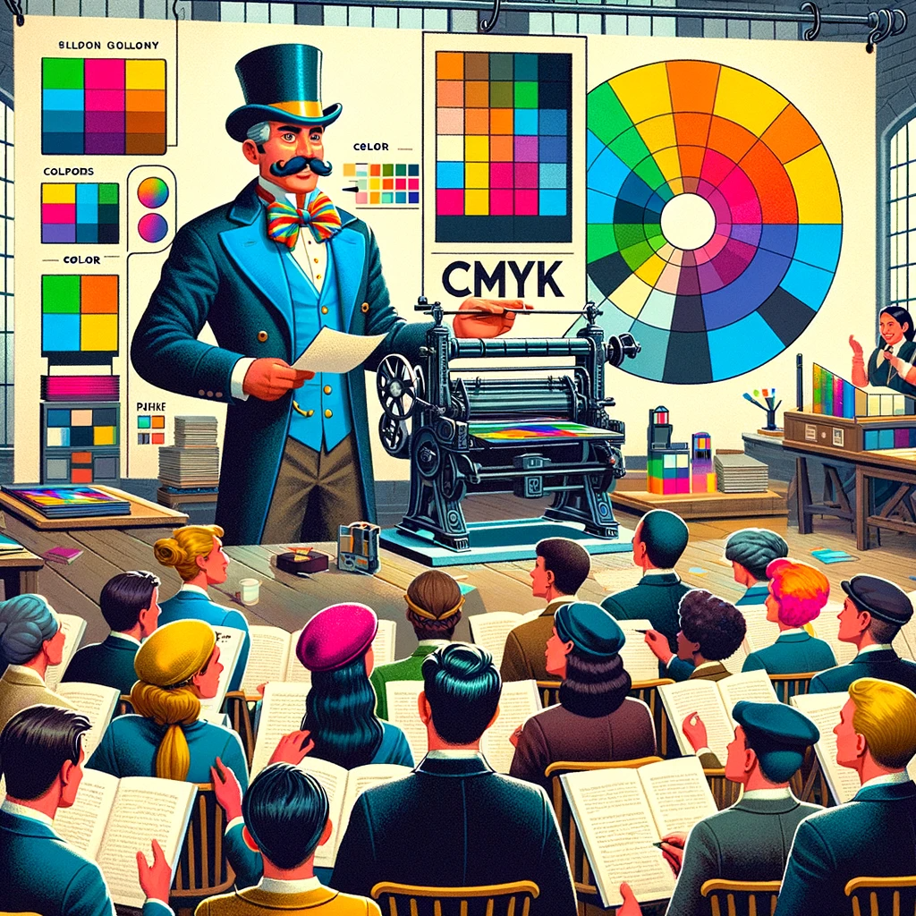
Poczynając od branż osadzonych w internecie podstawowymi zapisami kolorów będzie tak zwany zapis heksadecymalny (w postaci symbolu „#” i sześcioznakowego oznaczenia, na przykład #FF0001) oraz RGB. O ile drugi zapis jest dla nas w miarę klarowny, zwłaszcza po rozwinięciu skrótu (Red, Green, Blue), o tyle zapis pierwszy wydaje się być kompletną abstrakcją. Nic dziwnego, gdyż jest to zapis „maszynowy” – zrozumiały dla komputera. Jednak jego złowroga postać wcale nie musi być dla nas tożsama z zawrotami głowy. Jest to bowiem translacja koloru RGB do postaci liczbowej. Szczegóły tego procesu opiszemy w jednym z następnych artykułów, jednak dla rozbudzenia Waszej ciekawości wspomnę tylko że w skrócie kolor hex to trzy pary znaków z których każda para odpowiada wartości od 0 do 255 dla każdej składowej RGB.
Inaczej sprawa ma się w poligrafii – tam zapis heksadecymalny jest nieobecny, a kolor podany w RGB jawi się jako amatorski – porównywalny do pierwszych pytań nowego stażysty w dziale. Prawdziwi designerzy bowiem stosują zapis CMYK. O tym czym dokładnie różni się CMYK od RGB również opowiem w innym artykule, póki co jedynie pozostawię Was z informacją dość oczywistą – CMYK posiada cztery składowe – Cyjan, Magenta, Żółty oraz Czarny. Ale to jedynie wierzchołek góry lodowej, bowiem w drukarni znajdziemy również wzmianki o Pantone, Madeira, HKS czy RAL.
Dlaczego tak się dzieje? Komu to potrzebne?
Zacznijmy od oczywistości – lawendowy, burgundowy czy beżowy choć pięknie brzmią i wydają się dla nas intuicyjne są ciężkie do jednoznacznego zidentyfikowania. Na sto osób zapytanych o kolor beżowy każda wskaże delikatnie inny odcień, a już nazwy kolorów takie jak róż wenecki, ugier czy khaki wydają się być domeną jedynie artystów czy domów mody. Ciężko zatem wyobrazić sobie sytuację w której grafik dostaje polecenie wykonania logo w odcieniu delikatnego szkarłatu dopełnionego malachitem. Ten słysząc taką kombinację najpewniej zaproponowałby urlop na żądanie. Dlatego też wprowadzone zostały tak zwane systemy kolorystyczne, takie jak RGB, CMYK, HSL czy Lab, które za pomocą wartości liczbowych określają precyzyjnie składowe danego koloru co niweluje obawę o to, że kolor zostanie przedstawiony inaczej niż widziałby go Klient.
Jednak precyzja to nie zawsze prostota. Modele kolorystyczne to miliony kombinacji poszczególnych składowych. I ponownie, ciężko wyobrazić sobie sytuacje w której drukarnia pieczołowicie przygotowuje kolor składający się dokładnie z 47,5% czerwieni, 21,5% zieleni oraz 31% niebieskiego. Dlatego też w drukarniach (za wyłączeniem tak zwanych cyfrowych metod druku) stosuje się palety kolorystyczne – Pantone, Madeira, HKS czy RAL.
Paleta, a model kolorów
Jak już napisałem wcześniej model kolorów określa sposób definiowania koloru poprzez ustalenie składowych danego koloru oraz sposobu i zakresu ich łączenia. Przykładowo: dla RGB każda składowa może mieć wartość 0-255, w CMYKu zaś 0-100, HSL z kolei to system w którym pierwsza składowa może przyjąć wartość 0-360, a dwie pozostałe 0-100.
Paleta kolorów nie określa nam składowych, a „jedynie” przedstawia jasno określone kolory, którymi możemy się posługiwać. Działa to identycznie jak na przykład paleta kolorów Dulux, gdzie nie możemy dowolnie mieszać sobie różnych kolorów, a jedynie dostajemy opasły katalog próbek. W tym miejscu kupujący wie dokładnie jak wyglądać będzie powiedzmy szczypiorkowa zieleń. Palety graficzne różnią się tak naprawdę od tego wzorca jednym szczegółem – kolory z reguły są tutaj określane numerami i symbolami.
Kim jest Pan Tone?
Wiemy już, że jest to paleta kolorów, a ściślej mówiąc najpopularniejsza paleta kolorów stworzona przez firmę Pantone Inc®, która w podstawowej formie zawierała ponad 1100 kolorów. Wartość ta jednak sukcesywnie jest powiększana. Literatura naukowa często nazywa ją również „skalą kolorystyczną” albo „systemem identyfikacji barw” od oryginalnej nazwy „Pantone Matching System” z której z kolei zapożyczono też alternatywne określenie kolorów – PMS. Pomijając jednak dywagacje akademickie przyjmijmy dla uproszczenia że to po prostu Paleta kolorów używana w poligrafii.
Dlaczego jest ona aż tak popularna? Zapewne dlatego, że była pierwszą tego typu i tak udaną próbą stworzenia jednolitego standardu kolorów- łatwego do przedstawienia, rzetelnego systemu w którym jasno określamy dostępne kolory i łatwo możemy je zweryfikować. Ale zaraz, przecież do tego służy nam RGB albo CMYK. Dlaczego ich nie stosujemy? Pomijając wspomniany wcześniej problem z przygotowaniem farby o bardzo ściśle określonych składowych jest jeszcze jeden ważny powód ku korzystaniu z palety, a nie modelu barw.
Jeśli wyświetlimy sobie konkretną grafikę na kilkunastu różnych urządzeniach otrzymamy kilkanaście delikatnie różnych grafik. Ma to związek chociażby z oświetleniem panującym w pomieszczeniu, komponentami monitora lub wyświetlacza, dokładnością odwzorowania barw czy stanem technicznym urządzenia. Do tych niewielkich przekłamań dodać należy nieco większy problem – kiedy chcemy zobaczyć zdjęcie w modelu CMYK, tak naprawdę widzimy jedynie jego „translację” – zdecydowana większość komercyjnych monitorów i wyświetlaczy operuje jedynie w przestrzeni RGB. To znaczy „mechanicznie”. Oczywiście możemy sobie ustawić inny model kolorystyczny w programie graficznym ale i tak de facto ekran buduje obraz ze składowych RGB. Aby mieć pewność że widzimy kolor CMYK dokładnie takim jakim powinien on być, powinniśmy zaopatrzyć się w drogi, specjalistyczny monitor CMYK, który będąc w pełni sprawny i po odpowiedniej kalibracji, w odpowiednich warunkach świetlnych dałby nam dopiero rzeczywisty pogląd na dany kolor CMYK. Problemów na linii RGB – CMYK jest oczywiście więcej, ale ten jeden wystarczy żeby wiedzieć jak ciężkim zadaniem byłoby „dogadanie się” co do wyglądu danego koloru.
Tutaj na scenę wkraczają palety kolorów – po pierwsze zmniejszają one znacząco ilość kombinacji wynikowych dzięki czemu zamiast milionów niewiele różniących się barw otrzymujemy mniejszą ilość znacznie łatwiejszych do rozróżnienia wariantów w obrębie palety. Drugą zaletą są wzorniki kolorów – te pokazują dokładnie ilość wariantów oraz próbki kolorów na bazie oryginalnych farb Pantone. Każdy wzornik dodatkowo, na ostatniej „stronie” udostępnia specjalny tester w postaci dwóch pasków farby. Zasada jest prosta – jeśli paski są identyczne znajdujemy się w warunkach idealnych do sprawdzania kolorów na wzorniku, co oznacza że obejrzany przez nas kolor będzie identyczny jak ten na wydruku. O ilu unikalnych kolorach mówimy? Pantone na przykład udostępnia kilka tysięcy kolorów rozdzielonych pomiędzy kolory powlekane (błyszczące), niepowlekane (matowe), metaliczne czy neonowe.
Krewni i znajomi grafika
Zatem wiemy już dlaczego powstał wzornik Pantone i dlaczego jest on tak popularny, a nawet niezbędny w pracy grafika. Skąd zatem inne palety? HKS, RAL czy Madeira wydają się być zbędne i jedynie komplikują sprawę zwiększając ilość potencjalnych możliwości. HKS i RAL są de facto „jedynie” alternatywą dla Pantone oferując nieco inne podejście do kreowania koloru. Rzeczywiście są one niezbyt popularne, dominując głównie w niemieckich drukarniach. Inaczej sprawa wygląda z Madeirą. Ta paleta to tak naprawdę standard kolorów nici przemysłowych. Używa się jej zatem w procesie haftu dekoracyjnego, bowiem ciężko byłoby zabarwić nić konkretnym Pantonem albo wartością CMYKową. Na szczęście, w odróżnieniu od sytuacji z Pantone sama Madeira wyciąga pomocną dłoń w stronę projektantów oferując łatwo dostępne narzędzie do translacji farb Pantone na nici Madeira.