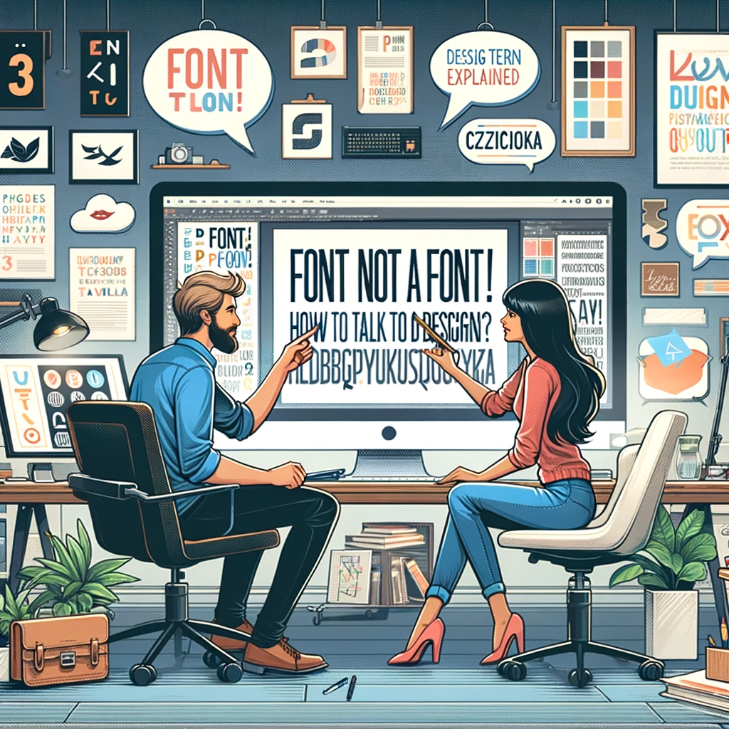
When you smell in the air the subtle scent of decaf latte spiced slightly with the aroma of printer toner cartridges, and you increasingly find bitten pencils and eraser marks in the nooks and crannies of your office, you know that he has appeared - the shy, elusive, sneaking between departments - the graphic designer. This almost mythical being that can put everyone to shame with an out-of-the-box idea or knowledge of countless colors is a distinctive creation. But above all, what strikes the eye is the peculiar jargon he uses, which he fiercely defends.
Dialogue with a graphic designer is not easy - at any moment you can be overwhelmed by wordiness resulting from a sudden surge of inspiration, or, on the contrary, you will lose contact with him when the office just ran out of soy milk. So how do you talk to a "creative" to always have his attention and get information from him before he disappears somewhere in search of inspiration?
This calm, at times even frightened specimen in front of you can turn into a sinister creature in a split second if you dare to use certain names. What for you is an ordinary term for him can be an insult and the worst blasphemy. So let's get clear on what the graphic designer is saying and how it relates to deeply ingrained phrases present in everyday language:
- FONT
is the set of letters used in text. Customarily referred to as a font by non-creatives. For "creative" people, saying the word for czc... in the context of a font is a reason to stop talking to such an individual. It is worth watching out for this because graphic designers are monstrously sensitive on this point - COMPOSITION
The arrangement of elements in a work area. Colloquially speaking, it is what and how it is located in a file. Graphic designers distinguish between static composition and dynamic composition in which elements appear appropriately dynamic in relation to each other (for example, by using bevels). - SPAD
An additional area extending beyond the frame of the printed piece. It serves as an insurance for the graphic designer against poor fit of elements in the printing process. When asked about the size of the bleed, you can confidently throw in a value between 2.5 and 5mm. - DPI
From English dots per inch, or the number of dots per inch. It is customary to use this parameter to describe the resolution of graphics, although a seasoned graphic designer will use the term only for print. In the case of digital graphics, he will use the abbreviation PPI. - CMYK
A basic, color model used by professional graphic designers. It is made up of four components (Cyan, Magenta, Yellow and Black). The eternal enemy of the RGB model, for a graphic designer dealing with print, the basic system for describing colors. - HALFTONE
Also called raster - in printing, a technique used to print a multitonal image using a single tone. In short, with the help of appropriate density of printed dots of the image, we can get the effect of transition of color into another without diluting the ink. - LAM
Text column. A term more applicable to multi-page publications and their printing. Hence, we can distinguish between page layouts - single and multi-page - each of which is suitable for a different type of publication and will correspond differently to the content. - CROSS
is not the fancy opposite of straight, although it has a lot in common with it. In short, it's a shape in vector graphics that defines exactly the framework within which the "content" of a layer is contained. Usually 1 curve describes the shape of one color in a vector graphic. - BRAND
- AKCYDENS
- MOCKUP
- LOGOTYPE
- SZERYF
- WIREFRAME
- TRASING